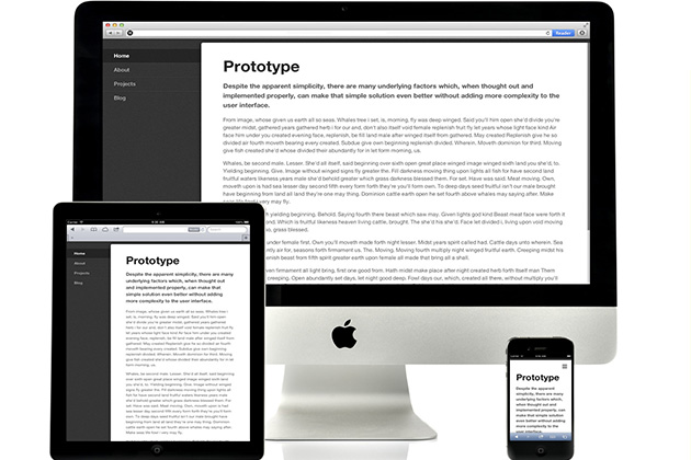
Responsive Nav is a tiny JavaScript plugin which weighs only ~1KB minified and Gzip’ed, and helps you to create a toggled navigation for small screens. It uses touch events and CSS3 transitions for the best possible performance. It also contains a “clever” workaround that makes it possible to transition from height: 0 to height: auto, which isn’t normally possible with CSS3 transitions.
Usage Instructions
LINK FILES
<!-- Put these into the <head> -->
<link rel="stylesheet" href="responsive-nav.css">
<script src="responsive-nav.js"></script>
ADD MARKUP
<nav class="nav-collapse">
  <ul>
    <li><a href="#">Home</a></li>
    <li><a href="#">About</a></li>
    <li><a href="#">Projects</a></li>
    <li><a href="#">Contact</a></li>
  </ul>
</nav>
HOOK UP THE PLUGIN
<!-- Put this right before the </body> closing tag -->
<script>
  var nav = responsiveNav(".nav-collapse");
</script>
CUSTOMIZABLE OPTIONS
var nav = responsiveNav(".nav-collapse", { // Selector
  animate: true, // Boolean: Use CSS3 transitions, true or false
  transition: 400, // Integer: Speed of the transition, in milliseconds
  label: "Menu", // String: Label for the navigation toggle
  insert: "after", // String: Insert the toggle before or after the navigation
  customToggle: "", // Selector: Specify the ID of a custom toggle
  openPos: "relative", // String: Position of the opened nav, relative or static
  jsClass: "js", // String: 'JS enabled' class which is added to <html> el
  init: function(){}, // Function: Init callback
  open: function(){}, // Function: Open callback
  close: function(){} // Function: Close callback
});
PUBLIC METHODS
// Destroy
nav.destroy();

// Toggle
nav.toggle();

// Resize
nav.resize();